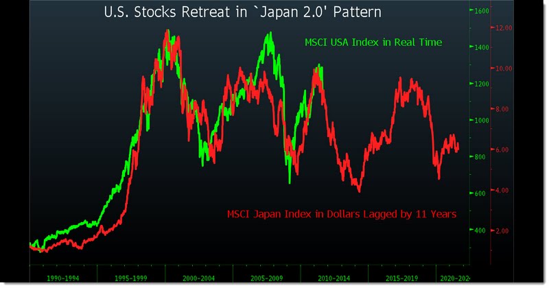
Yesterday, Barry Ritholtz posted this rather disturbing chart overlaying the Nikkei and S&P 500 from boom to bust (see below). Normally a chart like this is easy to shrug off, but since I’ve been making the Japan comparison since 2008 it makes me pay a bit more attention. Will the US stock market mirror their growth pattern? I highly doubt it as this chart implies an immediate plunge back to the March 2009 lows….
On the other hand, if the bond market is foreshadowing anything (and yes, by that standard we look awfully Japanese) then we shouldn’t expect the last few years of equity market performance to repeat any time soon. Hopefully, we make it through the next few years without a Chinese collapse, a European implosion or substantial worsening in the US balance sheet recession. If not, we might want to get used to the latter portion of this chart and the direction in trend from the top left to the bottom right….

Mr. Roche is the Founder and Chief Investment Officer of Discipline Funds.Discipline Funds is a low fee financial advisory firm with a focus on helping people be more disciplined with their finances.
He is also the author of Pragmatic Capitalism: What Every Investor Needs to Understand About Money and Finance, Understanding the Modern Monetary System and Understanding Modern Portfolio Construction.

Comments are closed.