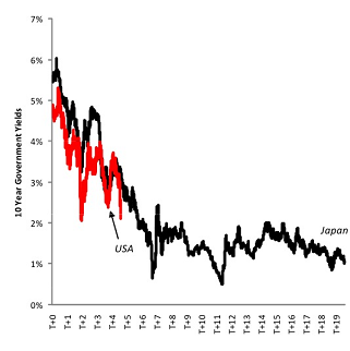
Here’s a great follow-up on the previous post about the Japanese equity disease. The following chart from Nomura (via Joe Weisenthal at Business Insider) show US Treasury yields compared to Japanese Government Bonds (see below). Clearly, we’re following a Japanese path.
As I mentioned with the equity post, I am hopeful that we’re more than a few years into a 20 year stagnation. I think we have a number of different factors working for the USA that Japan did not have at the time of their balance sheet recession. The risk here is that we fail to fully de-leverage and instead go back to our old ways of ponzi finance, insufficient government spending, private sector re-leveraging, etc. And while I am trying to be optimistic about the current situation in the USA, I have to admit that I am not entirely confident that this group of central bankers and politicians are leading us in the right direction.

Mr. Roche is the Founder and Chief Investment Officer of Discipline Funds.Discipline Funds is a low fee financial advisory firm with a focus on helping people be more disciplined with their finances.
He is also the author of Pragmatic Capitalism: What Every Investor Needs to Understand About Money and Finance, Understanding the Modern Monetary System and Understanding Modern Portfolio Construction.

Comments are closed.