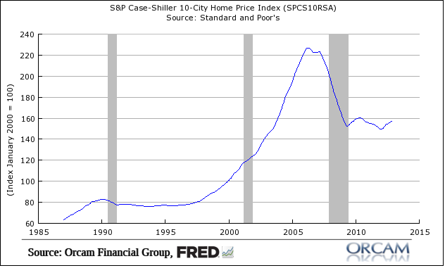
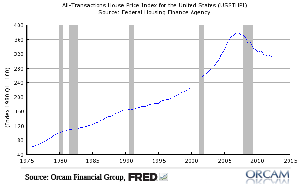
I’ve become much more constructive about housing in the last year. But I still don’t understand the euphoria in some circles. For the most part, I am still in the camp that says we’re in a post-bubble “work out” period. That means the big price declines are past us, but the upside remains modest in most markets.
That said, I still don’t see the recovery in the various housing indices that many are raving about. To me, this looks almost exactly like what I’ve been predicting all along. A sideways market that is consistent with past bubble experiences. Think Nasdaq, Shanghai, Gold in the 80s, etc. In essence, it looks like a big L.
So far, the price action in US housing doesn’t look like anything that unusual for a post-bubble environment and it looks a lot more like a post-bubble “work out” than a recovery to me. Obviously, I am biased towards believing that my view will be right, but you tell me what the pictures show….
Charts via Orcam Financial Group:
Mr. Roche is the Founder and Chief Investment Officer of Discipline Funds.Discipline Funds is a low fee financial advisory firm with a focus on helping people be more disciplined with their finances.
He is also the author of Pragmatic Capitalism: What Every Investor Needs to Understand About Money and Finance, Understanding the Modern Monetary System and Understanding Modern Portfolio Construction.


Comments are closed.