It’s not uncommon to see very short-term charts backing extremely near sighted views. I don’t know why that is. I guess maybe it’s a result of the new normal where everyone has an attention span of about 30 seconds. But it really annoys me. We often see this type of short-termism surrounding interest rate moves and they’re generally shown as a way to “prove” that the bond vigilantes are here or the insolvency of the USA is now starting. Over the course of the last 5 years I’ve repeatedly shown charts countering these arguments that tries to put things in perspective.
So, I find it unusual to see Paul Krugman, also an inflation myth debunker and insolvency myth debunker, citing a very short-term interest rate chart to show that there has been a significant and meaningful move in rates as a result of the “terrible taper”.
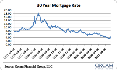
Of course, if you put the recent move into perspective then you get the chart below. That little tiny move in the bottom right hand corner shows how mortgage rates have moved all the way back to, gasp, their 2011 levels when we were routinely seeing bullish articles about how interest rates are so low and should ease the debt burden on debtors.
Now, I wouldn’t say that the recent rise in rates will have zero impact on the economy, but do I think it’s going to torpedo the recovery? No, I think it’s just a case of traders being traders. They overplayed their hand on the downside and now they’re overreacting on the upside. What else is new? And why should anyone make a big fuss about a 1% move in interest rates that takes us all the way back to levels that are barely shy of all-time lows? This looks like another case of short-term thinking gone wrong….
Mr. Roche is the Founder and Chief Investment Officer of Discipline Funds.Discipline Funds is a low fee financial advisory firm with a focus on helping people be more disciplined with their finances.
He is also the author of Pragmatic Capitalism: What Every Investor Needs to Understand About Money and Finance, Understanding the Modern Monetary System and Understanding Modern Portfolio Construction.


Comments are closed.