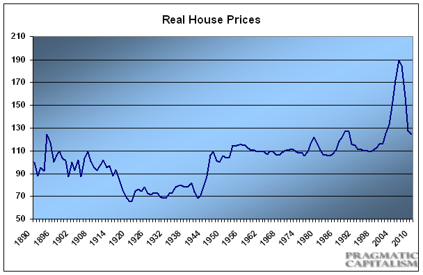
I can still remember the day I first came across the real house price chart in 2005. For me, it was the defining chart of the housing bubble. After all, how could house prices deviate so far from the rate of inflation which is so directly tied to wages? This seemed like such an obvious concept. And to me it perfectly showed the disequilibrium in the housing market. That disequilibrium and ensuing contagion turned out to be far greater than I presumed, but it shows the power of standing back and taking a 30,000 foot view at the macro picture. This one chart perfectly summarized all of my work on real estate in the years leading up to the peak. This is one of the beauties of charting. It doesn’t tell you the whole picture, but it certainly helps provide you with some perspective.
More importantly though, what is this chart telling us today? The updated version is attached below. Current levels are still consistent with an overvalued housing market though not nearly as bad as things had been just 5 years ago. The most recent reading of 114 tells us that housing prices are still at the upper end of the range their historical range:

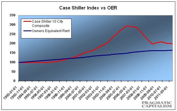
Another way of looking at housing prices is comparing the government’s owner’s equivalent rent index to the national house price index used by Case Shiller. This tells us a similar story to the real house price index. There is currently about a 15% discrepancy between the two:

The 30,000 foot view concludes: US house prices are still expensive. And while they may not be in a free fall any longer we’re unlikely to see any substantial rebound in the near-term.
Mr. Roche is the Founder and Chief Investment Officer of Discipline Funds.Discipline Funds is a low fee financial advisory firm with a focus on helping people be more disciplined with their finances.
He is also the author of Pragmatic Capitalism: What Every Investor Needs to Understand About Money and Finance, Understanding the Modern Monetary System and Understanding Modern Portfolio Construction.

Comments are closed.