
Great piece here by the NY Fed putting the history of T-Bond sell-offs in perspective. They compare the current environment to 1994 and 2003 when t-bonds lost over 10%. I won’t spoil the good presentation they have:
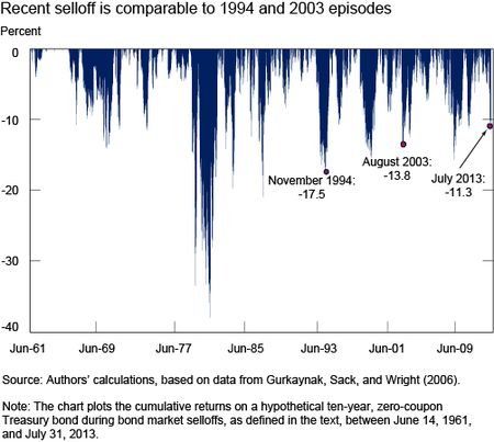
“The chart below plots the selloffs, showing that the recent one is comparable in magnitude, albeit somewhat smaller, to those seen in 1994 and 2003. In particular, the recent selloff reached a trough on July 5 with a cumulative return of -11.3 percent, versus -13.8 percent in August 2003 and -17.5 percent in November 1994. None of these episodes compares with the steep losses seen in the two Volcker era selloffs of 1979-80 and 1980-82. “
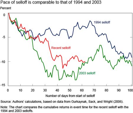
“Pace of Selloff Comparable to 1994 and 2003 . . .
The chart below plots the cumulative returns of three selloffs over time, relative to the start of each selloff, showing that the pace of the recent selloff is comparable to that observed in 1994 and 2003. Returns are quite similar over most of the first month in all three episodes. At the end of the first month through the second month, negative returns continue in the recent selloff and in 2003, but remain flat for some time in 1994. Returns in 1994 continue their downward trend after that, and bottom out about a year after the selloff starts, well after the end of the plotted event interval. “
Good stuff. Read the whole piece here.
Mr. Roche is the Founder and Chief Investment Officer of Discipline Funds.Discipline Funds is a low fee financial advisory firm with a focus on helping people be more disciplined with their finances.
He is also the author of Pragmatic Capitalism: What Every Investor Needs to Understand About Money and Finance, Understanding the Modern Monetary System and Understanding Modern Portfolio Construction.
Comments are closed.