
Someone sent me an email this evening with some details on the Paul Krugman response to James Montier which I discussed here. I had previously stated that the Krugman response was lacking meat. But it’s actually worse than that. It’s actually highly misleading and appears intentionally so.
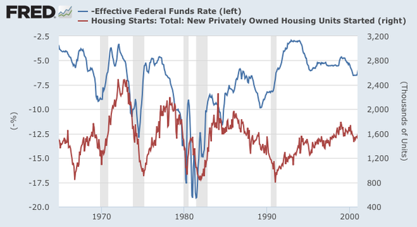
In the post Dr. Krugman tries to show how much interest rates matter by comparing the Fed Funds Rate with Housing Starts. He shows a chart and declares that there appears to be a strong correlation. Except, as this emailer notes, he appears to have shifted the chart to make it appear as though there’s a correlation where there isn’t one.
Here’s the Krugman chart:
And here’s the version that would have originally shown up when the data is pulled from FRED:
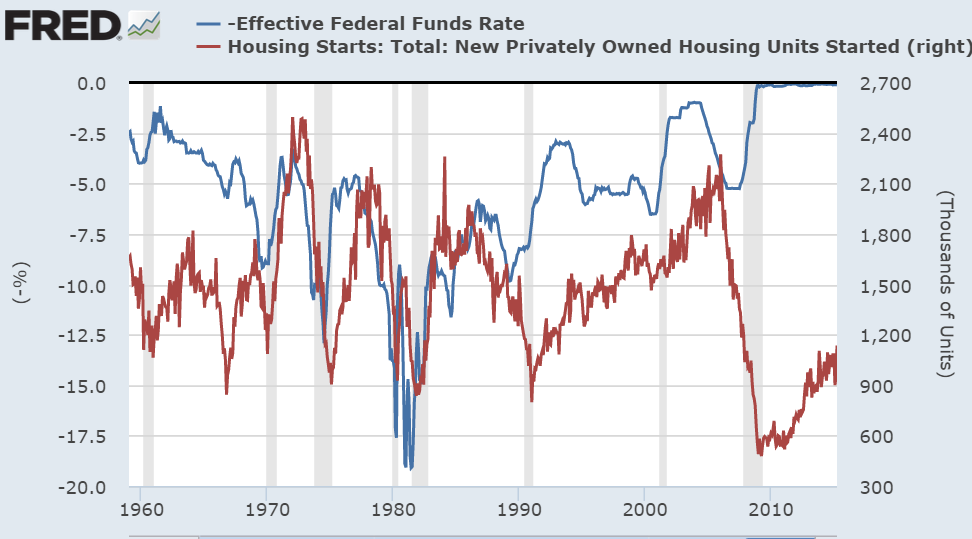
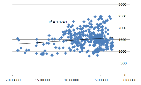
See what was done there? The period in the early 1960’s was removed and so was the period from 2000 on. In other words, out of a 55 year time period Dr. Krugman decided to remove 20 years worth of data because it fit his argument better. For those keeping track that’s removing almost 40% of an entire data set just because the data didn’t fit the narrative. And when you add those years back in you get a result that shows a very weak correlation:

I can understand why he might remove the period from 2008 on. But why remove the 1960’s data and the early 2000’s? After all, the 2000’s were the period of Alan Greenspan’s famous “conundrum” where interest rates appeared to have no correlation with the housing market. That’s not just an important part of this discussion, it’s a critical part given that it includes the housing bubble and is outside of the mythical Liquidity Trap era….
This is why people often complain about economics. When economists take a data set and just blatantly alter it to fit their argument it doesn’t do much to help build credibility for their work. Especially when you do it within a post that basically declares economists are smarter than everyone else who says they might not have the whole world figured out.
NB – James Montier wrote an important paper discrediting an important modeling technique used by many economists. And it deserves a better response than “I am super smart and here’s one [altered] chart to prove it”.
Update – Some people have noted that Paul Krugman says he specifically mentioned the era when monetary policy wasn’t used for averting bubbles. Which is true. But let’s be honest – Paul Krugman has always stated that traditional monetary policy loses its effectiveness in a liquidity trap. We weren’t in a liquidity trap prior to 2008 so there’s no reason for him to remove that data.
Further, if you review the original data he presented there really isn’t a relationship at all. In fact, it’s even weaker than the entire data set.
Lastly, there is real academic work showing that housing starts have, at best, a loose relationship with interest rates. This pre-crisis paper by USC economists concluded:
“We find that in the short run, changes in economic variables like interest rates or incomes do not impact change homeownership rates. We also find that interest rates influence housing starts in the short run, but that this impact fades over a longer horizon.
Overall, we find that interest rates do not appear to have a long-run impact on homeownership rates, rather our results indicate that rising incomes and changing demographics are the most important factors in explaining changing homeownership rates over time.”
None of this is to imply that interest rates don’t matter or that monetary policy doesn’t matter. But I think some economists have a tendency to put a bit too much faith in their theoretical models that are often based on mythical ideas like the Natural Rate of Interest. Unfortunately, instead of responding thoroughly to a well thought out critique, Dr. Krugman decided to offer up a lazy chart blog that didn’t prove his point in the first place.
Mr. Roche is the Founder and Chief Investment Officer of Discipline Funds.Discipline Funds is a low fee financial advisory firm with a focus on helping people be more disciplined with their finances.
He is also the author of Pragmatic Capitalism: What Every Investor Needs to Understand About Money and Finance, Understanding the Modern Monetary System and Understanding Modern Portfolio Construction.