

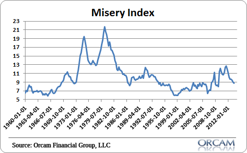
The s0-called “misery index”, a measure of inflation plus the unemployment rate, isn’t looking so miserable any more. For a while there we were starting to look a lot like the stagflation of the 70’s. Now it looks more like the stagnant muddle through that has come to persist.
Of course, the falling unemployment rate is due in large part to the participation rate, but we’ve also seen real jobs growth so it’s not all bad news there. And then the rate of inflation has remained low as aggregate demand has stagnated. It’s not a pretty picture, but it could be a lot worse.
Mr. Roche is the Founder and Chief Investment Officer of Discipline Funds.Discipline Funds is a low fee financial advisory firm with a focus on helping people be more disciplined with their finances.
He is also the author of Pragmatic Capitalism: What Every Investor Needs to Understand About Money and Finance, Understanding the Modern Monetary System and Understanding Modern Portfolio Construction.
Comments are closed.