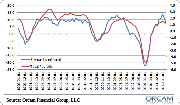
I saw this video on Bloomberg last week showing the rate of change in business investment in machines compared to employment. I’ve seen similar charts of nondefense capital goods orders all over the place in recent months explaining why there is downside risk to the economy (see here for instance).
This particular Bloomberg segment said the chart was indicative of a large decline in payrolls. I think it’s a relatively extreme and somewhat misleading position.
The nondefense orders chart is too narrow in my opinion and subject to a great deal of cherry picking. It’s better to take the full look at private investment using gross investment. And when we do so we not only increase the correlation between investment and employment, but we get a far less scary looking picture. In fact, the current reading shows that employment is growing just about where one might expect.
You can see the full Bloomberg segment here.
(Chart via Orcam Investment Research)
Mr. Roche is the Founder and Chief Investment Officer of Discipline Funds.Discipline Funds is a low fee financial advisory firm with a focus on helping people be more disciplined with their finances.
He is also the author of Pragmatic Capitalism: What Every Investor Needs to Understand About Money and Finance, Understanding the Modern Monetary System and Understanding Modern Portfolio Construction.


Comments are closed.