
Here’s a really nice compilation of charts from some good market strategists and economists via Business Insider’s Matthew Boesler. I contributed the following:
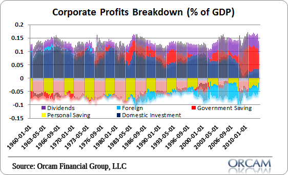
“The following chart shows the sector contribution of corporate profits as a % of GDP. What this chart is showing us is that corporate profits have been primarily driven by private investment historically, but the housing bubble and bust caused an unprecedented decline in private investment.
In the last 5 years this decline was offset primarily by government spending which added directly to corporate profits and has helped send profits to record highs. The risk to corporate profits, in my opinion, appears to be to the downside as the deficit is shrinking quickly and we’re unlikely to see an equally offsetting increase from any other component barring another housing bubble and investment boom.”
Enjoy.
Mr. Roche is the Founder and Chief Investment Officer of Discipline Funds.Discipline Funds is a low fee financial advisory firm with a focus on helping people be more disciplined with their finances.
He is also the author of Pragmatic Capitalism: What Every Investor Needs to Understand About Money and Finance, Understanding the Modern Monetary System and Understanding Modern Portfolio Construction.
Comments are closed.